Cynthia Corbett Gallery is delighted to present a special curation at Art on Paper - Booth C03 running during New York art week, September 8-11, 2022 at Pier 36, New York City, coinciding with The Armory Show. Our showcase will feature top modern and contemporary imaginative works on paper by Deborah Azzopardi, Christina Benz, Klari Reis, Isabelle van Zeijl, Tuëma Pattie, Cristina Schek, Alastair Gordon, Matt Smith, Andy Burgess and Yuko Nishikawa who will present an exceptional installation in the central lounge, please see Yuko's work here.
For all sales enquiries please contact Gallery Founder & Director Cynthia Corbett at info@thecynthiacorbettgallery.com
-
 Yuko NishikawaGROUP: PM, 2022Recycled paper pulp and galvanized steel wire86 x 86 x 137 h cm
34 x 34 x 54 h inches
-
Yuko NishikawaPM (Saffron), 2022Recycled paper pulp and galvanized steel wire46 x 46 x 69 h cm
18 x 18 x 27 h in -
Yuko NishikawaPM (Orange), 2022Recycled paper pulp and galvanized steel wire48 x 48 x 56 h cm
19 x 19 x 22 h in -
Yuko NishikawaPM (Orange Green), 2022Recycled paper pulp and galvanized steel wire61 x 61 x 61 h cm
24 x 24 x 24 h in -
Christina BenzLorem ipsum No.14, 2019Drawing, ink and water colour on Arches paper with deckle edges (300 g/m2), museum quality frame76 x 56 cm
30 x 22 1/4 in. -
Christina BenzLorem ipsum No.11, 2018Drawing, ink and water colour on Arches paper with deckle edges (300 g/m2), museum quality frame76 x 56 cm
30 x 22 1/4 in. -
Christina BenzLorem ipsum No.38, 2021Drawing, ink and water colour on Arches paper with deckle edges (300 g/m2), museum quality frame76 x 56 cm
30 x 22 1/4 in. -
Christina BenzLorem ipsum No.37, 2021Drawing, ink and water colour on Arches paper with deckle edges (300 g/m2), museum quality frame76 x 56 cm
30 x 22 1/4 in. -
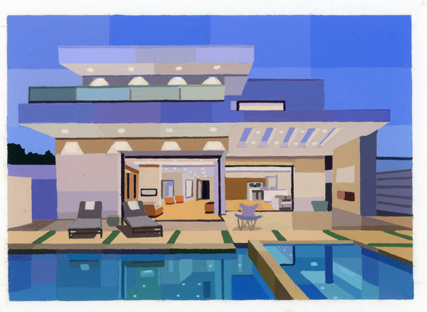
Andy BurgessCharles Gwathmey Residence , 2022Gouache on watercolor paperFramed size:
26.7 x 30.5 cm
10 1/2 x 12 in. -
Andy BurgessGoodloe House, Florida , 2022Painted paper collage35.6 x 40.6 cm
14 x 16 in. -
Andy BurgessDouble Diamond House , 2022Painted paper collage27.9 x 30.5 cm
11 x 12 in. -
Andy BurgessWakasa House (Horiguchi Sutemi) 1939 Tokyo, Japan. , 2022Gouache on watercolor paper27.9 x 33 cm
11 x 13 in. -
Andy BurgessDesert Diamond House, 2022Gouache on watercolor paper27.9 x 33 cm
11 x 13 in. -
Andy BurgessOverhang House , 2022Gouache on watercolor paper27.9 x 33 cm
11 x 13 in. -
Andy BurgessTerrace at dusk , 2022Gouache on watercolor paper,27.9 x 33 cm
11 x 13 in. -
Andy BurgessBalcony House , 2022Gouache on watercolor paper27.9 x 33 cm
11 x 13 in. -
Andy BurgessRed Rail House , 2022Gouache on watercolor paper27.9 x 33 cm
11 x 13 in. -
Andy BurgessFrench Deco House , 2022Gouache on watercolor paper33 x 27.9 cm
13 x 11 in. -
Andy BurgessCritical Resemblance House, 2022Gouache on Paper27.9 x 30.5 cm
11 x 12 in. -
Andy BurgessVilla Taddei, 2022Gouache on Paper27.9 x 30.5 cm
11 x 12 in. -
Andy BurgessSarasota Mid Century, 2021Ink on Paper27.9 x 30.5 cm
11 x 12 in. -
Andy BurgessCalifornia Palm House, 2021Ink on Paper27.9 x 30.5 cm
11 x 12 in. -
Andy BurgessIris Concrete House, 2022Gouache on Paper
work in progress12.7 x 17.8 cm
5 x 7 in. -
Andy BurgessDwellings I, 2022Gouache on Paper. Framed.27.9 x 30.5 cm
11 x 12 in. -
Andy BurgessDwellings V, 2022Gouache on Paper27.9 x 30.5 cm
11 x 12 in. -
Andy BurgessDwellings IV, 2022Gouache on Paper27.9 x 30.5 cm
11 x 12 in. -
Andy BurgessDwellings II, 2022Gouache on Paper27.9 x 30.5 cm
11 x 12 in. -
Andy BurgessPenguin Mirror Yellow, 2022Gouache on card25.4 x 27.9 cm
10 x 11 in. -
Andy BurgessPenguin Mirror Pink, 2022Gouache on card25.4 x 27.9 cm
10 x 11 in. -
Andy BurgessPenguin Forward, 2022Gouache on paper33 x 38.1 cm
13 x 15 in. -
Andy BurgessPalazzo, 2022Watercolor, gouache and ink on folded paper35.6 x 27.9 cm
14 x 11 in. -
Andy BurgessCunieform , 2022Watercolor, gouache and ink on folded paper35.6 x 27.9 cm
14 x 11 in. -
Andy BurgessSummer Moods , 2022Watercolor, gouache and ink on folded paper35.6 x 27.9 cm
14 x 11 in. -
Andy BurgessSolar Flare , 2022Watercolor, gouache and ink on folded paper35.6 x 27.9 cm
14 x 11 in. -
Andy BurgessPictograph , 2022Watercolor, gouache and ink on folded paper35.6 x 27.9 cm
14 x 11 in. -
Andy BurgessBlue Moon , 2022Watercolor, gouache and ink on folded paper35.6 x 27.9 cm
14 x 11 in. -
Andy BurgessSonido Amarillo , 2022Vintage paper, card and book linen collage43.2 x 33 cm
17 x 13 in. -
Andy BurgessSonido Rojo, 2022Vintage paper, card and book linen collage43.2 x 33 cm
17 x 13 in. -
Andy BurgessSonido Verde, 2022Vintage paper, card and book linen collage43.2 x 33 cm
17 x 13 in. -
Andy BurgessSonido Café, 2022Vintage paper, card and book linen collage43.2 x 33 cm
17 x 13 in. -
Andy BurgessBorzoi Books, 2021Vintage paper collage19.1 x 19.1 cm
7 1/2 x 7 1/2 in. -
Andy BurgessGolden City , 2021Vintage paper and book linen collage25.4 x 22.9 cm
10 x 9 in. -
Andy BurgessAmerican Poetry , 2022Vintage paper and book linen collage25.4 x 20.3 cm
10 x 8 in. -
Andy BurgessDouble Mountain, 2021Acrylic Painted Paper collage21.6 x 17.8 cm
8 1/2 x 7 in. -
Andy BurgessStylus, 2021Painted Paper collage30.5 x 30.5 cm
12 x 12 in. -
Andy BurgessThe Station , 2020Painted Paper collage on archival card30.5 x 33 cm
12 x 13 in. -
Andy BurgessTracks, 2022Ink and gouache on folded paper27.9 x 33 cm
11 x 13 in. -
Andy BurgessMoon Phases , 2022Painted card collage29.2 x 24.1 cm
11 1/2 x 9 1/2 in. -
Andy BurgessAlphabet 1 , 2021Painted Paper collage39.4 x 34.3 cm
15 1/2 x 13 1/2 in. -
Andy BurgessAlphabet 2, 2021Painted Paper collage39.4 x 34.3 cm
15 1/2 x 13 1/2 in. -
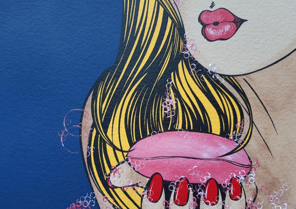
Deborah AzzopardiShoe, 2022Limited-edition silkscreen print.
Paper: Somerset Tub Sized 410gsm. Radiant White.
Background: Non-tarnishing Aluminium leaf.
Shoe: Gold leaf. Ruby Red cut resin rhinestones.
Cushion: Two shades of red, the sash and logo are gold ink.59 x 67 cm
23 1/4 x 26 1/2 in.Edition of 5 plus 1 artist's proof (#4/5) -
Deborah AzzopardiQueen, 2022Limited-edition silkscreen print.
Paper: Somerset Tub Sized 410gsm. Radiant White.
Background: Blue Ink and blue art glitter.
Lips: Two shades of pink with gloss varnish applied by hand.
Crown: Slow drying enamel varnish with silver ink mixed in. Silver leaf is applied by hand, on top of the crown area. Platinum leaf applied by hand on the balls at the base of the crown.
Diamond Dust/Clear glass glitter applied on the balls at the top of the crown.
All applied by hand.119 x 98 cm
46 3/4 x 38 1/2 in.Edition of 7 in commemoration of the Queen’s seven-decade reign plus 3 artist's proofs (#4/7) -
Deborah AzzopardiPetite Pure, 2021Acrylic on 640g Arches paper37 x 58 cm
14 1/2 x 22 3/4 in. -
Deborah AzzopardiPure, 2021Acrylic on 640g Arches paper122 x 90 cm
48 1/4 x 35 1/2 in. -
Deborah AzzopardiHe Loves Me, He Loves Me Not, 2011Limited Edition Silkscreen Print on Fabriano 308gsm paper.Framed Size:
80 x 110 cm
31 1/2 x 43 1/4 in.Edition of 12 (#2/12) -
Deborah AzzopardiGossip, 2016Limited Edition Silkscreen Print
Paper: 410 Somerset TubFramed:
106.8 x 106 cm
42 1/8 x 41 3/4 in.
Unframed:
91.4 x 91.4 cm
36 x 36 in.Edition of 10 (#2/10) -
Deborah AzzopardiBbrrrinnnggg, 2007Signed and NumberedLimited Edition Silkscreen Print on 300gsm weight Claro Silk PaperFramed:
110 x 110 cm
43 1/4 x 43 1/4 in.Edition of 50 (#23/50) -
Deborah AzzopardiSave the Date, 2018Limited Edition Silkscreen Print with Silver Leaf on 410g Somerset SatinTub.Framed
114 x 114 cm
45 x 45 in.Edition of 15 (#2/15) -
Deborah AzzopardiI Just Called To Say..., 2020Acrylic on 300g PaperUnframed
33 x 35.6 cm
13 x 14 in.
Framed
40cm x 43 cm
16 x 17 in.
-
Deborah AzzopardiI Just Want To..., 2014Acrylic on Paper30.5 x 55.9 cm
12 x 22 in. -
Deborah AzzopardiDeborah Azzopardi, Box Set (Cheeky & Follow me), 2022Screen Prints
Paper; 410g Somerset Tub.2 x A5 (15 x 21 cm) Artist ProofEdition of 30 plus 6 artist's proofs (#4/30) -
Deborah AzzopardiDeborah Azzopardi, Box Set (Cheeky & Follow me), 2022Screen Prints
Paper; 410g Somerset Tub.2 x A5 (15 x 21 cm) Artist ProofEdition of 30 plus 6 artist's proofs (#8/30) -
Tuëma PattieBlue Venice, 2016Oil on CardUnframed
22 x 32 cm
8 5/8 x 12 5/8 in. -
Tuëma PattieThe Lake Bridge - Glyndebourne, 2018Oil on Card36 x 24 cm
14 1/8 x 9 1/2 in. -
Tuëma PattieGlyndebourne Opera House, 2018Oil on Card36.5 x 24 cm
14 3/8 x 9 1/2 in. -
Tuëma PattieThe Lake at Glyndebourne, 2018Oil on Card22 x 31 cm
8 5/8 x 12 1/4 in. -
Tuëma PattieGlyndebourne in the Rain, 2018Oil on Card24 x 36.5 cm
9 1/2 x 14 3/8 in. -
Cristina SchekAlice, 2021Framed Archival Pigment Print
Anti-Reflective Museum Glass77 x 115 cm
30 1/4 x 45 1/4 inEdition of 5 plus 3 artist's proofs (#2/5) -
Cristina SchekFern Girl, 2022Framed Archival Pigment Print
Anti-Reflective Museum Glass115 x 77 cm
45 1/4 x 30 1/4 in.Edition of 8 plus 2 artist's proofs (#2/8) -
Alastair GordonThirty Feathers and One Mouse, 2019Acrylic and oil on paper.
Framed.94 x 72 cm
37 1/8 x 28 3/8 in. -
Alastair GordonPaper Dart Quodlibet IV, 2019Acrylic and oil on paper.
Framed.94 x 72 cm
37 1/8 x 28 3/8 in. -
Matt Smith (British)Kenya: Article 162, 2019Signed and numberedSilkscreen Print on Handmade Indian Cotton Paper94 x 74 cm
37 x 29 1/4 in.Edition of 20 (#15/20) -
Matt Smith (British)Bahrain: Article 171, 2019Signed and numbered
Silkscreen Print on Handmade Indian Cotton Paper94 x 74 cm
37 x 29 1/4 in.Edition of 20 (#15/20) -
Matt Smith (British)Tanzania, Textile Banner, 2022Printed Linen
Unique piece135 x 300 cm
53 1/4 x 118 1/4 in. -
Isabelle van ZeijlBe, 2019C-print mounted on dibond, perspex face in tray frame
113 x 103.1 cm
44 1/2 x 40 1/2 in.Edition of 7 plus 3 artist's proofs (#5/7) -
Isabelle van ZeijlOwn, 2019
Featured on the cover of Harper's Bazaar June 2019 Art Issue
C-print mounted on Dibond, perspex face in tray frame
113 x 103.1 cm
44 1/2 x 40 1/2 in.Edition of 7 plus 3 artist's proofs (#6/7) -
Isabelle van ZeijlResource, 2020C-print mounted on dibond, perspex face, in tray frame158 x 144 cms
62 1/4 x 56 3/4 inches
Smaller Size Available:
113 x 103.1 cm
44 1/2 x 40 1/2 inEdition of 8 plus 2 artist's proofs (#3/8) -
Isabelle van ZeijlFor Me, 2019C-print mounted on Dibond, Perspex face in tray frame
113 x 102.9 cm
44 1/2 x 40 1/2 in.Edition of 7 plus 3 artist's proofs (#4/7) -
Isabelle van ZeijlSupermodel III, 2015Perspex face mounted C- print in Italian handmade frame
NB: also available with non-reflective Plexiglass110 x 85 x 6 cm
43 1/4 x 33 1/2 x 2 3/8 in.Edition of 7 plus 2 artist's proofs (#4/7) -
Klari ReisGrafted, 2022Pigmented Epoxy on Wood Panel61 x 45.7 x 5.1 cm
24 x 18 x 2 in. -
Klari ReisFlirting, 2021(orange background) epoxy on paper64.8 x 49.5 cm
25 1/2 x 19 1/2 in. -
Klari ReisWild, 2021epoxy on paper25.5in x 19.5in
-
Klari ReisVegetation, 2021epoxy on paper25.5in x 19.5in
-
Klari ReisBask, 2021epoxy on paper25.5in x 19.5in
-
Klari ReisOver Under, 2021(orange background) epoxy on paper64.8 x 49.5 cm
25 1/2 x 19 1/2 in. -
Klari ReisSnap Dragon, 2021(orange background) epoxy on paper64.8 x 49.5 cm
25 1/2 x 19 1/2 in.


ABOUT THE ARTISTS
Deborah Azzopardi acquired her worldwide fame for the joyous Pop Art images she has created over the past 40 years. Her unique and feminine take on contemporary art is best described by the esteemed art critic Estelle Lovatt: ‘America has Lichtenstein, we have Azzopardi!’ “Sometimes you just want to curl up under a blanket. With a good book. A piece of chocolate. A man. This is what Deborah Azzopardi’s pictures make me feel like doing. They are me. They remind me of the time I had a red convertible sports car. I had two, actually. And yes, they are you, too.”
This year, Deborah Azzopardi has created two bespoke limited-edition
silkscreen print series celebrating the Queen’s Platinum Jubilee: Queen,
featuring a reimagination of Her Majesty the Queen Elizabeth II, and Shoe,
featuring the monarch’s bespoke coronation shoe, made by Roger Vivier.
Deborah comments on her relationship to the medium of paper:
"With nearly 40 years of being an artist, my preferred choice of paper is ARCHES. It is 100% cotton and branded by their own watermark to authenticate the paper. The cotton gives the paper beauty, a natural, lasting whiteness and a unique touch as well as strength. The slight texture is my personal choice – it is part of the process of artistic creation and expression. It holds the intensity of my colour as it is applied."
__________________
Christina Benz's works are visual statements on today's society. The most recent works focus on media culture in particular. Benz touches upon issues of identity linked to consumerism, branding, celebrity obsession and self promotion through reality media programs. Previous works deal with the fragility of being and contain minimal scenarios with dark but humorous undertones. Many of the protagonists are constrained in prolonged repetitive situations, however undeterred they continually strive to change their situation.
Christina comments on her relationship to the medium of paper:
“Lorem ipsum is the title for a new series of my drawings in ink and gouache on paper. The drawings are inspired by the aesthetics of ancient botanical illustrations. Instead of fieldwork and precise observations, however, the drawing process is exactly the opposite. The starting point is a colourful spot of colour. Once this is set, a black ink pencil takes over; it reacts to the colourful initial action and forms associative structures around the colour in great detail, which seem organic but defy clear classification.
The title pretends to
be Latin. In graphic design, lorem ipsum is used as a placeholder for a text
that has yet to be written.”
__________________
Klari Reis is an American artist with a Master of Fine Arts (2004) and an Associate Research Fellowship (2005) from the City and Guilds of London Art School. She lives and works in San Francisco and is represented internationally by Cynthia Corbett Gallery.
Klari Reis has invented her own medium, using epoxy polymer (a form of liquid plastic) with many added ingredients including pure pigment, acrylic and secrets. Reis’s design is almost otherworldly, her colours unique and her patterns inventive. Her artwork is both object and fine art and she is at the forefront of innovative use of art resources.
Klari comments on her relationship to the medium of paper:
"I started
working with epoxy on watercolor paper in 2001. Constantly experimenting with
new mediums and methods, my art practice involves biological experimentation,
looking for new visual experiences, material combinations, and reactions. The
pairing of the ultra-shiny epoxy on matt, porous and textual watercolor paper
create a beautiful and unique physical dichotomy. Watercolor paper
traditionally is designed to soak up water based paint. The paper has a soft
absorbent texture and feel, while the oil based epoxy seems to hover on top
mirroring the viewer. Glassless framing of these pieces was chosen to allow for
the textures and sheen to be seen from all angles."
__________________
Isabelle Van Zeijl is both model and maker, both object and subject. However, her work goes beyond the realm of individual expression that is so common in the genre of self-portraiture. It strives to be both universal and timeless. By circumventing the male gaze she effectively empowers the idea of a female beauty that is of and for itself. In a contemporary art world that condemns beauty as camouflage for conceptual shallowness, championing high esthetics is nothing short of rebellion.
Isabelle Van Zeijl was one of the Young Masters Emerging Woman Award Winners in 2017.
Isabelle comments on her relationship to the medium of paper:
"Looking at my work without knowing the background or methods, you might very well ponder whether it’s a Renaissance piece. With further insight you still might ask ‘is it a painting or a photograph?’ These depictions of historic female archetypes bring to mind a mysterious beauty that we’d typically associate with the classical age of portraiture.
Since I was little I have been creating self-portraits. Far before the era of digital photography, and before computer time, I made collages cut out of paper. In my childhood home I was surrounded by art books and high fashion magazines and I was mostly fascinated by the Renaissance portraiture, and the glossy images of the Supermodels in those magazines. They radiated a certain female power and beauty I was drawn to. I started to cut out the images of the Venus of Botticelli, and combined them with the models in the magazines. This is how I started to develop a playful collage technique.
Later on, after graduating Art School, I started to photograph myself and through digital post production and manipulation I still used the collages technique I developed in my earlier years. I crafted a vision of feminine power that will have the viewer questioning both historical and 21st-century concepts of beauty.
Whether you are an art historian or casual gallery visitor, the effect is immediate when you glance at my work: the representation of the timeless and adored that somehow connects to a collective consciousness. Through the exploration and manipulation of the visual vocabulary of the past and the implementation of modern photographic technology, my work possesses a timeless beauty, transcending the boundaries of epoch and media. The work which will be on display at The Art on Paper Fair has its roots in this paper collage technique."
__________________
Sussex-based Tuëma Pattie (b. 1938) was born in Dublin and studied at the Belfast College of Art, Central Saint Martins and Morley College in London and with Piers Ottey, Christopher Baker in Sussex and Robin Child in Devon.
In her days in Belfast and London, she took advantage of urban scenes as her subject matter. She then had a long period in which she took time out to have two children and to support her husband in his career. This meant it was difficult to find the time for her beloved painting, as was the case for many women in that era. With the move out of London in 1989, she did have the subsequent benefit of much foreign travel. Subject matter was carefully gathered with the resultant explosion of energy into her canvases, with paintings from the Galapagos, Antarctica, Spain, Italy and Uzbekistan as well as her beautiful West Sussex.
In October 2020 the Cynthia Corbett Gallery presented a major retrospective entitled Tuëma Pattie Retrospective: From Conventional To Experimental at La Galleria in St. James's, London. The retrospective featured over 100 original paintings that were offered for sale for the first time in Pattie's career.
“To me, painting has always been an opportunity to interpret imaginatively what I see in front of me. The facts are there - it is how one brings them to life that is the magic”.
Tuëma Pattie__________________
Cristina Schek is the ‘photo-sensitive’ kind. She thinks in pictures; her imagination is always in focus. A Transylvanian living in London, she creates conceptual portraits exploring identity and the nature of representation. She usually works as her own model and has captured herself in a range of guises and personas which are often whimsical and a touch romantic, employing amusing and impactful visual puns.
Away from the worn-out, out-of-date academic portrait of the female muse, Cristina Schek’s attention-grabbing images are inspired by literature and history. As a woman, though the lens of her eye, she created a new, unique, visual language influencing and motivating us to be as progressive and visionary as we are. To be assertive, bold, self-assured powerful, and confident. To develop and enlarge our value(s). To think, feminist weight solid enough, in images not just of her, but of you and me, in Schek’s sumptuous, surrealistic, delightful imaginings.
Cristina comments on her relationship to the medium of paper:
"When I'm looking for fine art paper with a crisp, clean, and beautifully tactile feel to it, one of my first thoughts is to turn to German paper-maker Hahnemühle, who has been making paper since 1584. Yes, you read that date correctly; Germany's oldest paper maker has been making paper since the late 16th century.
The paper I’m using is acid-free and meets the highest archival standards. This is serious paper with strict quality control standards, made according to old recipes from the finest cotton fibres and pure spring water. It is bright and vibrant, yet produces very deep blacks. The subtle texture on the surface gives it an additional appearance of sharpness and depth. It is also highly resistant to ageing. It’s no joke when I say that my printed work will outlive me.
As works on paper do not benefit from vitamin D, to prevent sun damage I am always using Museum Glass which is specifically coated to shield from harmful ultraviolet rays. It is designed to be amazingly clear, eliminate reflections, as well as protective for my art long term.
I will close by saying this; I cry when I see my images printed. I feel a value and a pride that I cannot fully explain. And it is everything to me. Printing my work on paper fills me with joy and makes me feel connected to my work. The feeling is 'I made this' and it will be cherished for generations."
__________________
2020 Young Masters Guest Artist Alastair Gordon's practice takes the notion of a painting as a cultural artefact. At first these are paintings about paintings: images that oscillate between artefact and artifice. Certain questions emerge about the replication of the image, craft of the artist and certainty of the viewer.
Alastair comments on his relationship to the medium of paper:
“Paper finds itself in a surprising array of habitats. It belongs both in the frame and the sketchbook, preserved in perpetuity yet tossed out with the weekly recycling. For the artist, paper is the go-to medium for just about everything. My studio is full of paper. My bookshelves, materials drawers, walls, floor, bags, boxes and bins are saturated with paper. For me, the very essence of paper sparks interest. As a painter of still life and nature I am reminded that paper is, itself, a repurpose of nature. The fibres I scratch my charcoal across were once a tree. Their carbonous sinews decimated and reconstituted so I can draw another tree on their surface. Come to think of it, even my implement was once a tree. In this way, a perfect exchange of atoms to atoms, dust to dust and carbon to carbon finds itself ever in conversation through the simple act of making a drawing on paper.”__________________
UK-born Matt Smith is well known for his site-specific work in museums, galleries and historic houses. For Art On Paper we have the great pleasure of presenting Matt's fascinating prints which were part of a display at his exhibition 'Losing Venus' at Pitt Rivers Museum, University of Oxford. “Each of my prints is based on a different photograph in the collections at the Pitt Rivers Museum. The photographs were taken in countries where Britain either imposed or maintained homophobic legislation. It has been argued that this legislation was mostly a response to colonial panic about Western behaviour overseas, but the impact on the local population was to change how many societies viewed same-sex love and gender diversity."
Matt Smith was the Inaugural Young Masters Maylis
Grand Ceramics Prize Winner in 2014.
Matt comments on his relationship to the medium of paper:
"I chose a very specific paper for the Losing Venus screen prints. The prints address one of the legacies of colonial legislation and so the choice of medium needed to speak to this. The paper is hand made in India using cotton rag pulp. This gives the paper a unique profile ensuring that each print is fractionally different. Cottonchintz from India reflected the unequal trade between metropol and colonisedl and within European interiors. These prints use cotton paper to present a more nuanced and revisionist view of the world and its histories."__________________
Yuko Nishikawa creates a fantastical environment with her colorful, textural lively forms. With a hands-on, exploratory approach, she makes paintings, lighting, mobiles and sculptures using a variety of mediums including clay, wire, fabrics, as well as repurposed materials such as recycled paper and used eyewear lenses.
Her work reflects her accumulative experiences in architecture, restoration, interior and furniture design, crafts and engineering. Growing up in a small seaside town just south of Tokyo, Japan, Nishikawa received her B.F.A. in Interior Design from New York’s Fashion Institute of Technology in 2002. Since then, she has surveyed courthouses, hospitals and federal buildings; documented the Guggenheim Museum’s facade for the restoration project in 2008; and assisted in hospitality and residential interior design projects for some of NYC’s leading studios such as Clodagh, Bilhuber Inc. and Alexandra Champalimaud.
She currently works in her studio in the industrial area in Williamsburg, Brooklyn, NY, which she built out with friends utilizing demolished materials found in the building.Yuko Nishikawa comments on her ‘Memory Tourist’ installation:
“Memory Tourist combines part of my recent installations with new work, whose wire forms create line drawings in the air and connect colorful and airy repurposed paper “Cookies” which move in response to us when we walk by them and stir the air. To make these Cookies, I collect used photo-background paper from artists and photographers in my Brooklyn studio building. I break it down to pulp, and formulate it with bookbinders' glue into an air-dry clay. The rich colors come directly from the colors of the donated paper; there are no added paints or pigments. I mix pulps the way I would mix paints to make additional colors and effects, by blending blue pulp and red pulp to make a purple clay, for example. Mushy pulps make homogeneous colors, while crumbly pulps have a stippled effect. Finely blended pulps form a smoother surface like macaroons while coarser pulps become bumpier like oatmeal cookies.Over the last year I made mobiles for specific times and places, first for Cape Cod in May, then next for Vermont in November, this Spring for different neighborhoods in my hometown Brooklyn, and then this Summer for San Francisco. Through my traveling for these installations I began to think of the memory of the material - the paper. It retains the colors and the fibers it originally had in these mobiles, whose elements interact with one another as they swing, recreate relationships, and then part ways, like those who visit a place for pleasure.”
__________________
For all sales enquiries please contact Gallery Founder & Director Cynthia Corbett at info@thecynthiacorbettgallery.com


